Organizing FCCU’s public website around Personal, Business, and About Us, with task-based navigation that connects members to products, digital banking, and support.
At a glance
A clearer navigation hierarchy: audience context first, banking task second, product or service next.
In development on Kentico CMS · Planned launch: December 2026
OrganizationFirst Community Credit Union
My contributionEnd-to-end product design
ScopePublic website · IA · Responsive design
Platform & statusKentico CMS · Planned launch: December 2026
PartnersProduct, Engineering, Marketing & business stakeholders
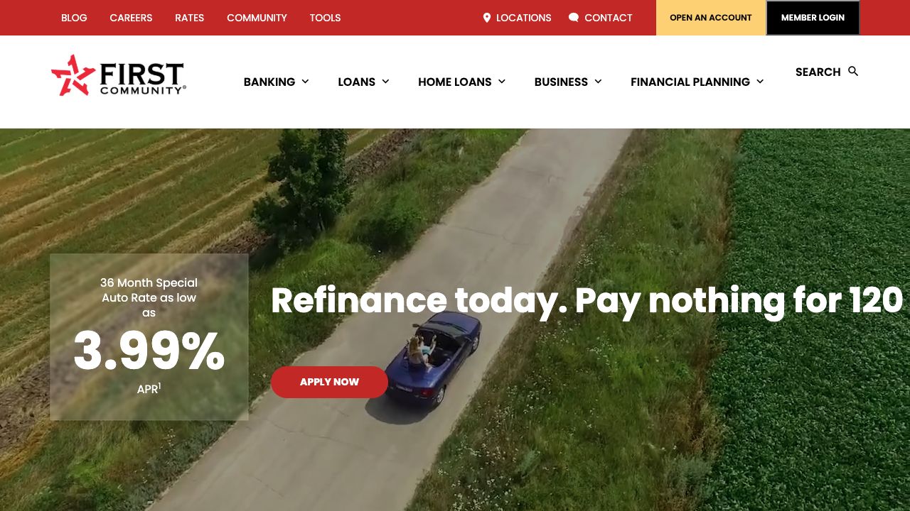
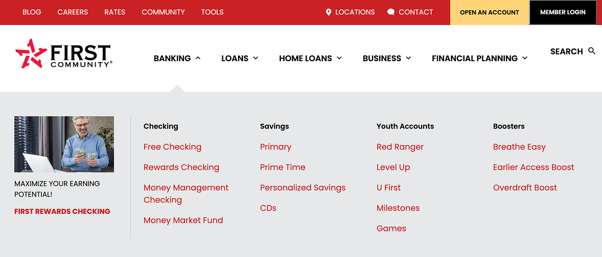
The original navigation placed Banking, Loans, Home Loans, Business, and Financial Planning alongside one another. Within Banking, product names and promotional content competed for attention. The redesign separates audience context from tasks and adds descriptive groupings so members can explore products without first knowing FCCU’s product names. These observations are grounded in the supplied screens; user research findings remain to be confirmed.
Homepage: live site vs. proposed redesign
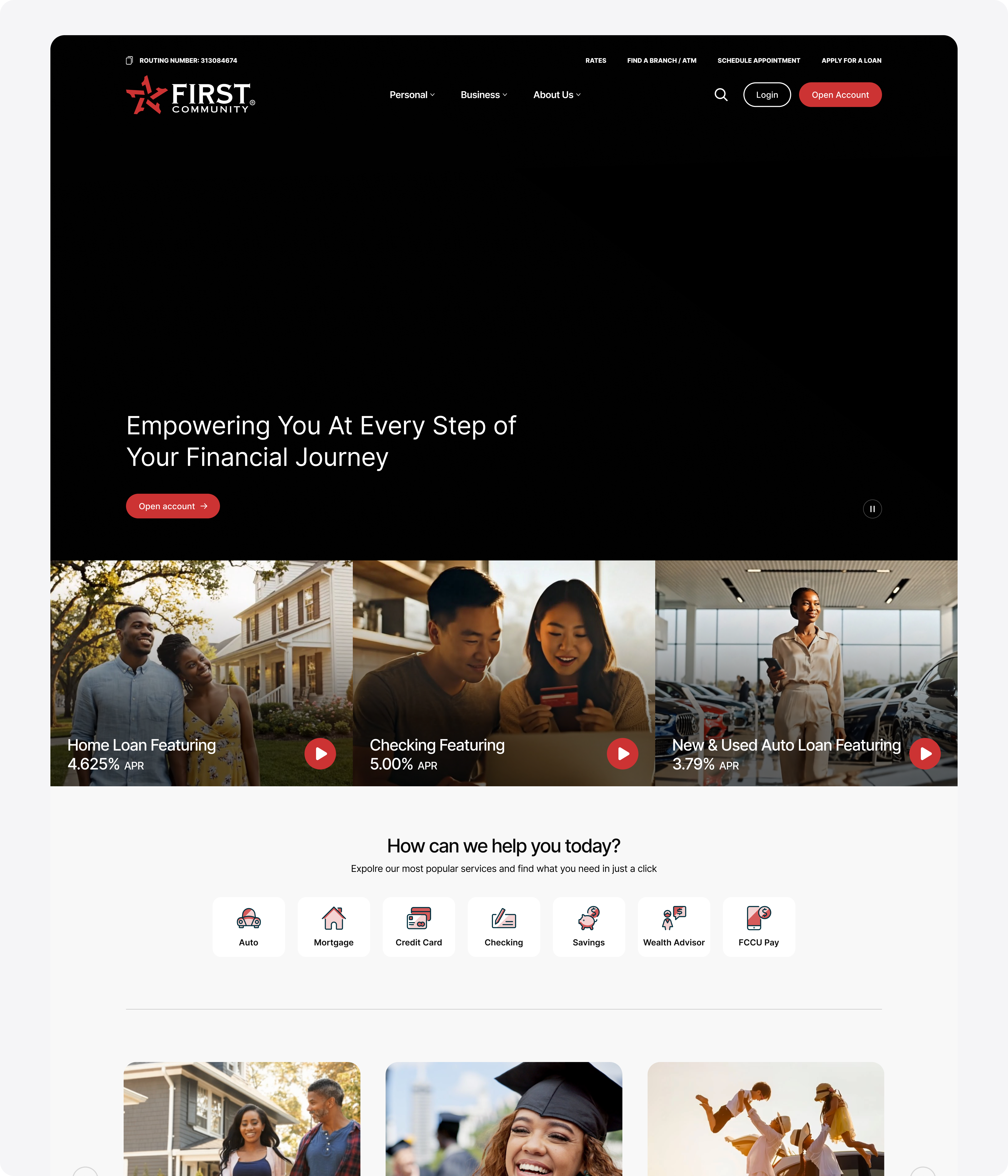
The live FCCU.org homepage, reviewed on November 12, 2026, serves as the baseline. The captured first view leads with a refinancing campaign. The proposed design leads with a general welcome and places several product entry points beneath it. The live site already provides shortcuts farther down the page; the redesign changes which choices appear first.
Before · Live site — A campaign occupies the main hero. Screenshot captured November 12, 2026; offers shown are archival.After · Proposed design — The welcome is followed by product entry points. Open the image for the full page.
Design intent: Give visitors with different goals a starting point while keeping promotional space available. The screenshots show the change in hierarchy; they do not establish whether people find their next step faster.
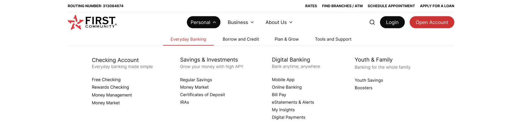
Change: Introduce Personal, Business, and About Us, with task groups under Personal such as Everyday Banking and Borrow and Credit. Why: Give visitors a clearer starting context before asking them to choose a specific product. Supporting evidence: The original places Banking, Loans, Home Loans, Business, and Financial Planning at the same level; the redesign visibly separates these levels.
Make categories easier to interpret
Change: Group Everyday Banking into Checking Account, Savings & Investments, Digital Banking, and Youth & Family, with short descriptions. Why: Help members understand the purpose of a group before interpreting individual product names. Supporting evidence: The original displays names such as Red Ranger, Level Up, and U First without explanatory descriptions. The revised groups provide context such as “Banking for the whole family.”
Focus the open menu on finding information
Change: Remove the promotional image panel from the shown menu and use a consistent text hierarchy for categories and links. Why: Give the navigation content more room and reduce competing visual elements while members scan for a destination. Supporting evidence: The original dedicates a column to a checking promotion; the redesigned state uses that space for navigational groups.
Keep frequent actions accessible
Change: Retain Search, Login, and Open Account as distinct header actions, with rates, branch finding, appointments, and loan applications in the utility row. Why: Preserve direct access to key tasks alongside product exploration. Supporting evidence: Both screenshots show account access and opening actions; the revised header also explicitly surfaces appointments and loan applications.
Evidence boundary: This comparison is a visual review of the supplied original and redesigned screens. The friction points are design observations, not measured user difficulties. Tree testing, task-based usability testing, and navigation analytics are needed to assess findability. The additional task-category level may improve organization but also introduces another navigation choice; testing should check that tradeoff. No measured improvement is claimed here.
03 / Leadership & key decisions
Create a clear hierarchy from audience to action.
The FCCU website is being built on Kentico CMS. The redesigned navigation and page layouts form part of this ongoing implementation.
My FCCU responsibilities include discovery, information architecture, customer journeys, flows, wireframes, prototypes, responsive high-fidelity design, and implementation review. I partner with Product, Engineering, Marketing, business stakeholders, and leadership. The selected navigation direction separates audience-level choices, task groups, product links, and persistent header actions. Alternative concepts and stakeholder tradeoffs remain to be documented.
The redesigned menu structure
Primary navigation: Personal · Business · About Us.
Within Personal: Everyday Banking · Borrow and Credit · Plan & Grow · Tools and Support.
Header actions: Search · Login · Open Account.
Utility links: Rates · Find Branches / ATM · Schedule Appointment · Apply for a Loan. The routing number remains visible in the utility area.
Grow your money with high APY. Regular Savings · Money Market · Certificates of Deposit · IRAs.
Digital Banking
Bank anytime, anywhere. Mobile App · Online Banking · Bill Pay · eStatements & Alerts · My Insights · Digital Payments.
Youth & Family
Banking for the whole family. Youth Savings · Boosters.
This structure reflects the supplied Everyday Banking screen. Expanded content for the other task groups and for Business and About Us is not shown. Money Market appears under both Checking Account and Savings & Investments in the supplied design; its placement needs a content review.
04 / Solution & validation
Connect the menu to a member’s next task.
Prototype testing with FCCU staff
A small group of FCCU staff across departments and stakeholders reviewed the redesign before launch. Feedback covered component consistency, how people found pages, the mobile experience, and the cues people relied on to understand where they were or what happened after an action.
Inconsistent components and an aging interface
The legacy site lacked a shared design system. The redesign uses Orbit UI as a foundation for consistent components and interaction states. The Orbit case study shows the component documentation.
Hard-to-find pages and weak location cues
The proposed navigation groups pages under audience and task labels. In the before-and-after menu screenshots, the active Personal and Everyday Banking selections show which part of the menu is open. The screenshots show menu orientation; they do not verify location cues on destination pages.
Mobile navigation felt unintuitive
The mobile redesign preview shows a compact header and a stacked layout. A follow-up task walkthrough would check whether members can find key pages on mobile without backtracking.
Insufficient feedback after actions
Orbit documents focus, loading, and input-error states. The website still needs a walkthrough of live interactions to verify that those states tell visitors what happened and what to do next.
Separate discovery concern: The project also identified low visibility in Google AI results. No baseline or improvement has been quantified, so this remains a follow-up discovery item rather than a usability result.
Member task: Find Free Checking
Scenario: You’re looking for a checking account and want to find Free Checking from the homepage. The screenshots show two navigation paths for this scenario. They don’t establish that participants tested this specific task or that one path performed better.
The redesign adds an audience and task grouping before the product link. That gives visitors more context, while also adding another choice. A useful validation check is whether people pick the right category on their first try and reach Free Checking without backtracking.
One homepage, adapted for desktop and mobile
The mobile design stacks the homepage content into a narrow reading flow, with compact header controls and vertically arranged product and community content. These screens document the responsive design direction; mobile navigation behavior and usability results still need supporting evidence.
Staff wanted clearer orientation. The desktop prototype highlights the open audience and task group. Destination-page cues are a separate area to validate.
Give mobile navigation its own review
The mobile experience felt unintuitive. The responsive prototype uses a compact header and a stacked homepage. Finding a product and returning to the menu are priorities for the next mobile test.
Use consistent feedback across controls
Staff flagged inconsistent components and unclear responses to actions. Orbit UI provides reusable focus, loading, and error states for implementation. Their behavior still needs to be checked on the website.
These are qualitative findings and design responses from internal review. Task completion, retest results, and post-launch impact remain unverified. Launch was planned for December 2026.
06 / Learning & next steps
Document the decisions behind the screens.
The original and redesigned desktop menus now document the change in hierarchy. Next, confirm category placement with content owners, test representative product and support tasks with members, and document keyboard and mobile menu behavior. Retest the revised navigation and interaction feedback with members. After launch, compare task completion and navigation behavior against the baseline, and track Google AI visibility separately.