Building FCCU’s cross-product design foundations with components, documentation, and a contribution model.
At a glance
Shared foundations and a contribution approach connecting FCCU’s website, member portal, and banking application.
Design system case · Adoption and efficiency measurements awaiting evidence
Organization
First Community Credit Union
My role
Design system owner
Scope
Foundations, patterns
&
governance
Focus
Cross-product consistency
Orbit UI · A more human way to bank.
02 / Problem & stakes
Connected products need shared foundations.
A public website, member portal, and banking application should feel like parts of the same institution. Without shared foundations, each surface can accumulate its own visual decisions, component behavior, and implementation exceptions.
Orbit connects those experiences through common foundations and patterns, supported by documentation and a contribution approach.
Why “Orbit”?
Orbit represents a connected system with a shared center: the people who use FCCU’s products. Foundations, components, and interaction patterns bring consistency to the experiences around that center.
Each product can serve its own needs while staying connected to the same design principles: room to evolve, with a common direction toward a more human way to bank.
Stakes & success criteria
Success means teams can reuse an appropriate pattern, understand its behavior, and contribute improvements without creating unnecessary product divergence.
The problem statement describes the consistency risk across products. A matched set of pre-Orbit screens would establish the baseline for a before-and-after comparison.
03 / Leadership & key decisions
Connect design foundations with engineering practice.
As the design system owner, I define reusable foundations, component patterns, and documentation across FCCU’s product surfaces. My contribution includes design tokens, Figma variables, responsive behavior, accessibility considerations, and implementation review with developers.
The system is also how people work together.
Decision 01
Separate foundations from product decisions.
A component library becomes hard to maintain when product-specific choices are embedded everywhere.
Design direction
Use a token architecture to connect primitive values, semantic meaning, and reusable components.
Tradeoff
More abstraction creates a learning cost. Naming and examples need to explain how to choose the right token.
Decision 02
Treat documentation as part of the component.
Visual assets alone do not explain behavior, edge cases, accessibility, or implementation expectations.
Design direction
Pair components with usage guidance, states, and engineering-facing documentation.
Tradeoff
Documentation requires maintenance. Useful examples and ownership matter more than a large catalogue.
Decision 03
Make adoption a shared practice.
A system only helps when teams can use it and contribute to it.
Design direction
Support adoption through engineering collaboration, contribution guidance, and recurring discussions.
Tradeoff
Governance should preserve coherence while leaving a practical path for new product needs.
Foundations: color and typography
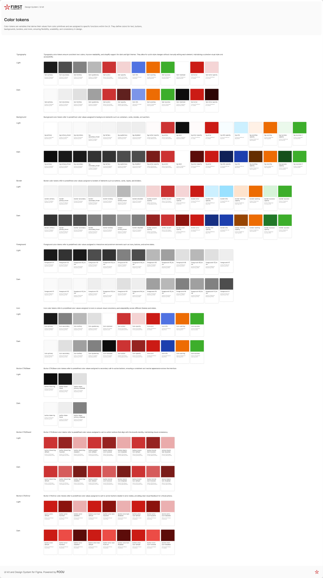
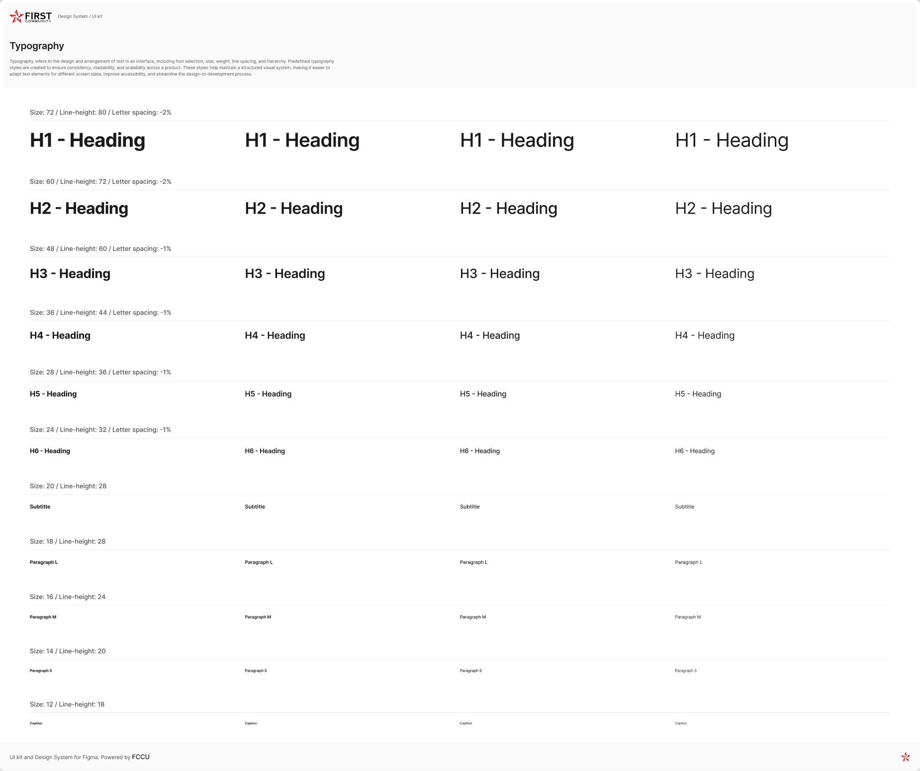
Color tokens for light and dark modes · Role-based variables cover text, surfaces, borders, icons, and button states, with values drawn from color primitives. View frame in FigmaShared typography scale · The library records size, line height, and weight for headings, body copy, and captions. View frame in Figma
Make reuse easy to start
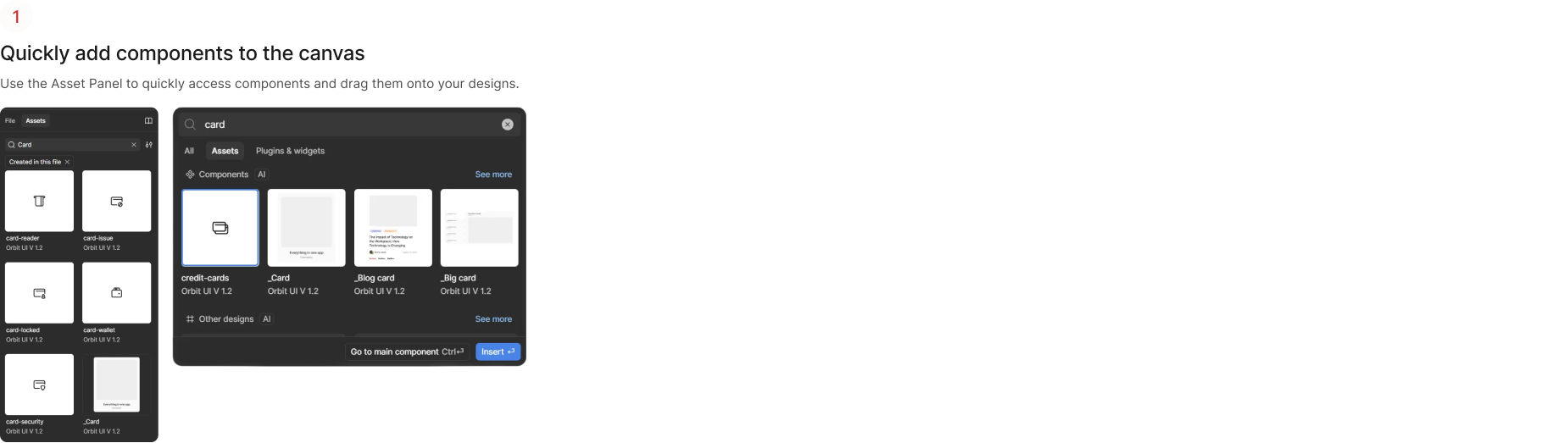
Getting started with Orbit · The guide shows designers how to find and insert an existing component from Figma’s Assets panel. View frame in Figma
04 / Solution & validation
Show the system working across real product needs.
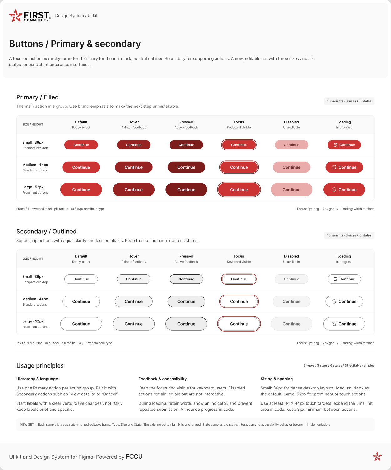
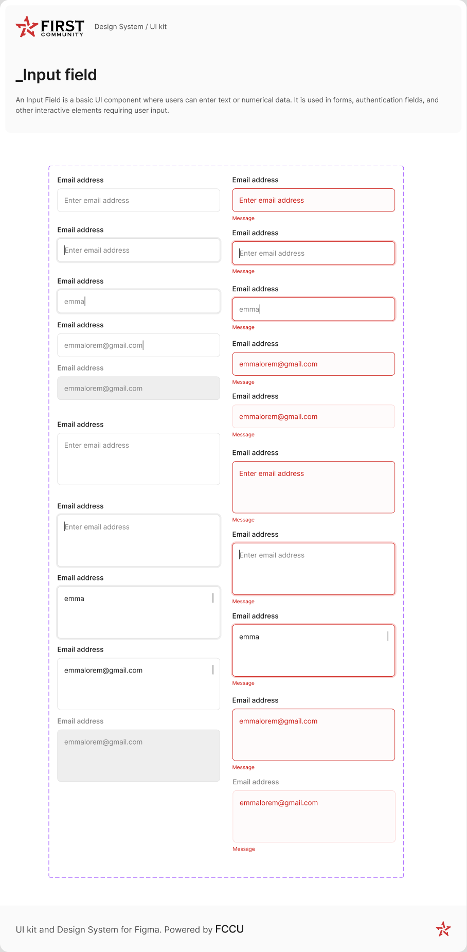
Orbit connects foundations to the details teams need to build. The button matrix documents action hierarchy and feedback from hover through loading. The input examples show how focus, entered values, and errors can be represented consistently across forms.
Validation and adoption
The supplied narrative describes engineering collaboration, recurring adoption discussions, and contributions to the library. Detailed adoption records, accessibility audits, and comparative implementation evidence have not yet been supplied.
Define the states teams need to implement
Primary and secondary button states · The documented set pairs filled primary actions with outlined secondary actions, across three sizes and six states. The guidance covers keyboard focus and retaining button width during loading. View frame in FigmaInput field states · Single-line and multiline examples show empty, focused, filled, disabled, and error states, with a message beneath the field. View frame in Figma
These Figma frames document intended behavior. Reviewing the same states in the public website, portal, and banking app would show where the implementation follows or diverges from the design.
05 / Outcomes
Measure a system by how it helps the team.
The supplied portfolio describes Orbit supporting the website, member portal, and banking app, alongside engineering contributions and a documented component library.
The useful leadership story is the connection between design decisions, implementation, and adoption. Library size alone cannot establish that impact.
Area
Evidence to discuss
Coverage
Shared foundations across three product surfaces
Governance
Contribution approach and engineering collaboration
Quality
Documented component behavior and accessibility considerations
Measurement boundary
Numerical efficiency, consistency, and accessibility claims from the earlier draft are excluded until their definitions and supporting audits are available.
06 / Learning & next steps
AI patterns need the same discipline.
In an AI product, shared patterns could cover source inspection, uncertain answers, review states, and action approval. This is a future application of my systems approach, rather than a claim that Orbit already includes AI components.
Next steps
Add one component’s evolution from product need to documented implementation. Show a contribution or exception decision, and provide evidence for adoption, quality, or implementation time before adding numerical outcomes.