Product design for FCCU’s responsive banking experience, focused on everyday transfers and account tasks.
At a glance
A clearer path through six everyday banking workflow areas, from account overview to money movement.
In development · Planned launch: January 2027
Organization
First Community Credit Union · Aug 2024–Present
My role
Lead / sole product designer
Partners
Engineering, product
&
compliance
Status
Development case · January 2027
02 / Problem & stakes
A banking experience that feels connected.
Signing in to FCCU Digital Banking
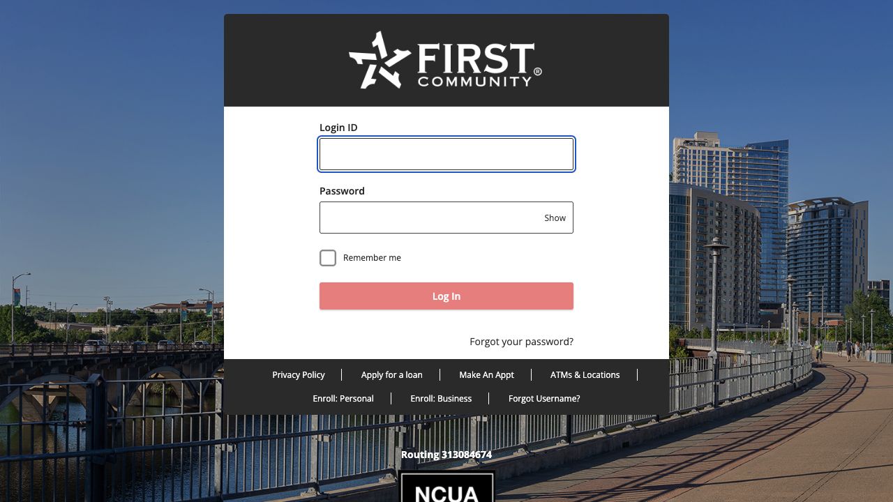
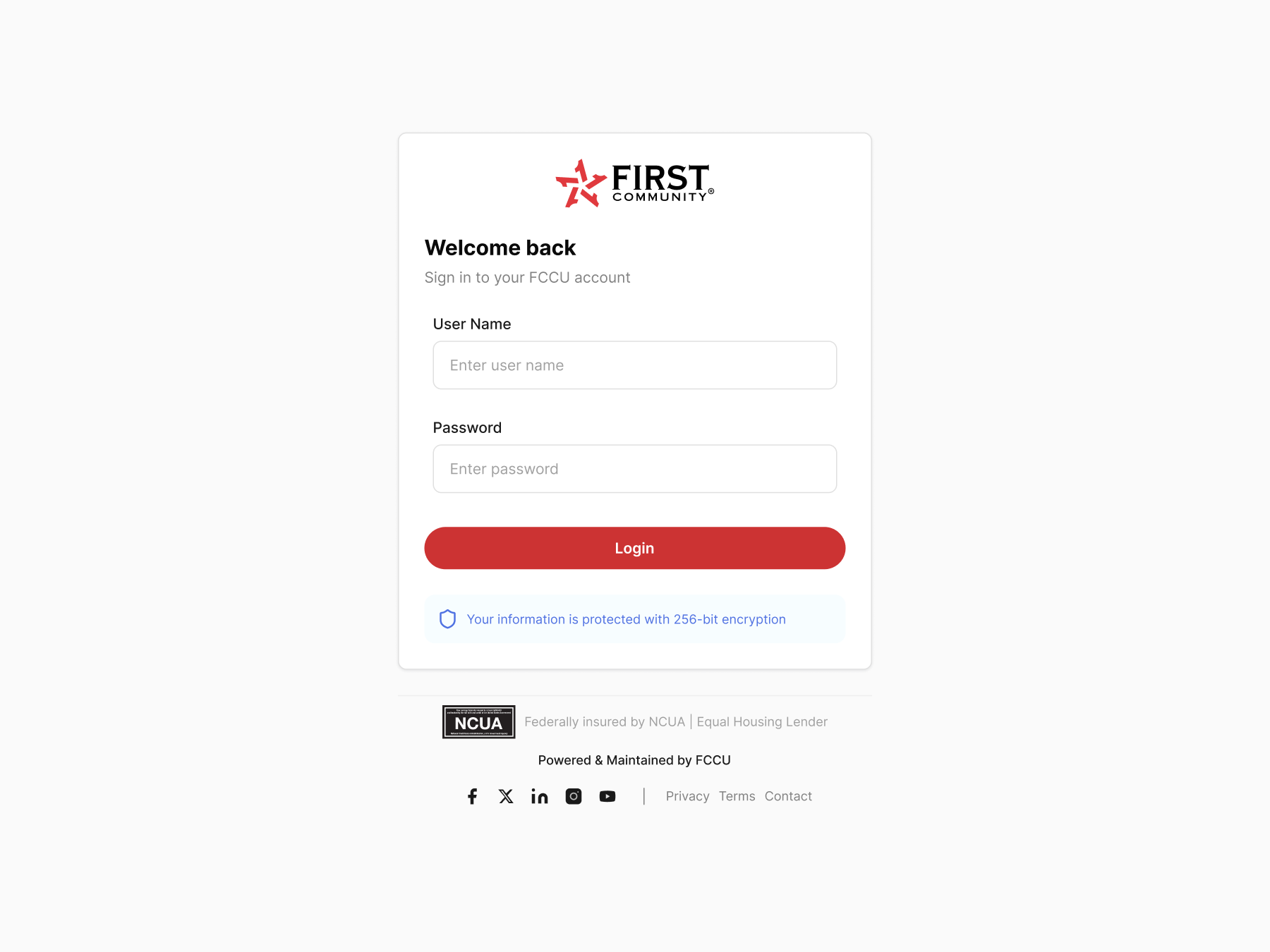
Before · Existing sign-in. The public entry screen includes sign-in fields alongside links for enrollment and account recovery.After · Redesigned sign-in. A centered card groups the username and password fields with one prominent Login button. A security notice sits directly below it.
The project brief describes replacing a vendor-led banking experience with an FCCU-owned responsive application. The scope spans internal transfers, member-to-member transfers, external ACH, loan payments, applications, and account overview.
My design responsibility was to make those connected workflows understandable while working with engineering, product, compliance, QA, and accessibility partners.
Designed for FCCU account holders
The audience includes all account holders using FCCU digital banking. Shared task needs include understanding balances, moving money with confidence, and knowing the status of an action.
Design priorities include clear balance labels, explicit source and destination accounts, a review step, and confirmation or recovery guidance. This is a retrospective needs summary, not a research-backed persona.
Stakes & success criteria
Success means members understand where their money is going, what the transfer route requires, and what will happen before they confirm an action.
From a dashboard of widgets to an account overview
Member task: Check a balance and find where to move money.
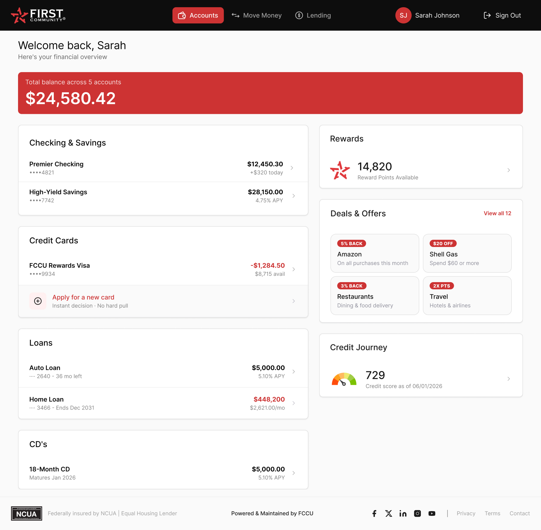
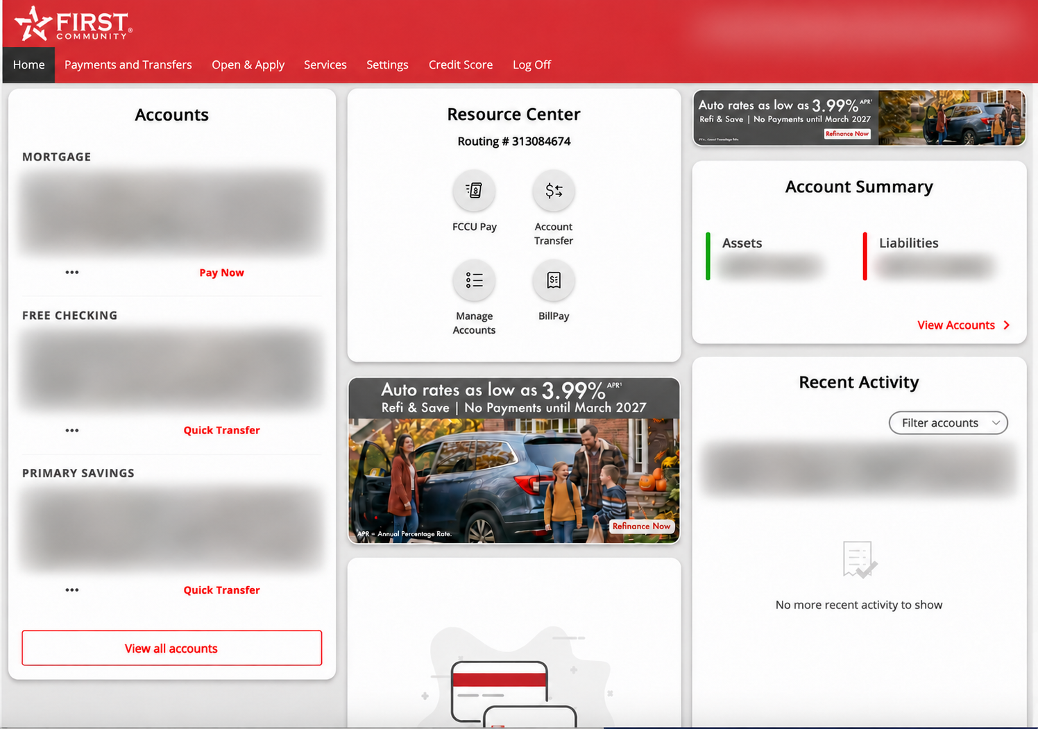
Before · Existing dashboard (redacted). The three-column layout gives accounts, the Resource Center, account summary, recent activity, and promotions space on the same screen. Transfer entry points appear in the header, Resource Center, and eligible account rows.After · Redesigned dashboard (sample data). The account overview leads with a balance summary and groups accounts by product type. Move Money is labeled in the primary navigation, while rewards, offers, and credit information sit beside the account list.
The redesign gives account scanning priority and provides a clearly labeled place to start a transfer. The screenshots show changes in hierarchy and entry points; they don’t establish faster task completion or show the existing transfer flow.
03 / Leadership & key decisions
Own the experience across connected banking journeys.
As the lead / sole product designer, I own information architecture, user flows, prototypes, responsive screens, and implementation review. I partner with Product, Engineering, Marketing, compliance, and business stakeholders to connect member needs with delivery constraints.
Clarity before confirmation.
Decision 01
Unify the entry point; explain the route.
Members should be able to start with “move money” without understanding the banking rails underneath.
Design direction
Create a common entry to transfers, then make the destination, timing, and requirements clear for each route.
Tradeoff
The paths cannot be identical when their rules differ. Consistency should support understanding without concealing those differences.
Decision 02
Make recipient identity visible early.
The original research narrative highlights uncertainty about which identity a recipient would see.
Design direction
Surface the recipient context early enough for the member to verify it before proceeding.
Tradeoff
Additional information competes for limited mobile space. Prioritize the details that prevent a mistaken transfer.
Decision 03
Bring constraints into the flow design.
Money movement involves timing, eligibility, and compliance constraints that affect the experience.
Design direction
Work through those constraints with product and engineering during flow definition and prototype review.
Tradeoff
Some friction protects the member. The design task is to explain necessary checks and remove avoidable confusion.
Internal transfer — user flow
Account overview: check balances and open Move Money.
Select an internal transfer and choose eligible source and destination accounts.
Enter the amount and supported date.
Review accounts, amount, and timing; edit if needed.
Submit and show the returned status and reference details.
Recovery paths retain entered values, explain field errors, and guide members to check activity when submission status is unclear. Eligibility, verification triggers, and recovery behavior require confirmation with Product and Engineering. This is a retrospective flow summary.
04 / Solution & validation
Make the transfer route and its consequences clear.
The solution uses a common starting point for moving money, then makes the recipient, transfer route, timing, and review step explicit. Different banking routes retain the details needed to understand their behavior.
What validation needs to establish
The original narrative describes usability evaluation of the six core workflow areas. The supporting study reports are still pending. The case will show which tasks were tested, where members hesitated, and what changed after testing once that evidence is supplied.
Find and start an internal transfer
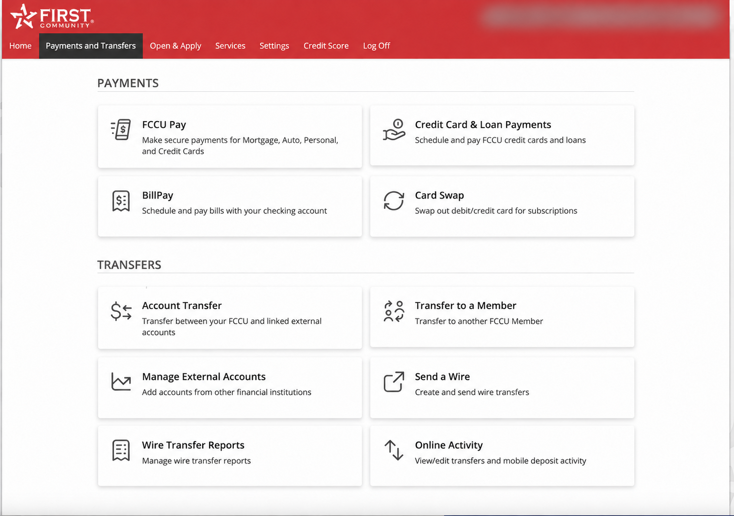
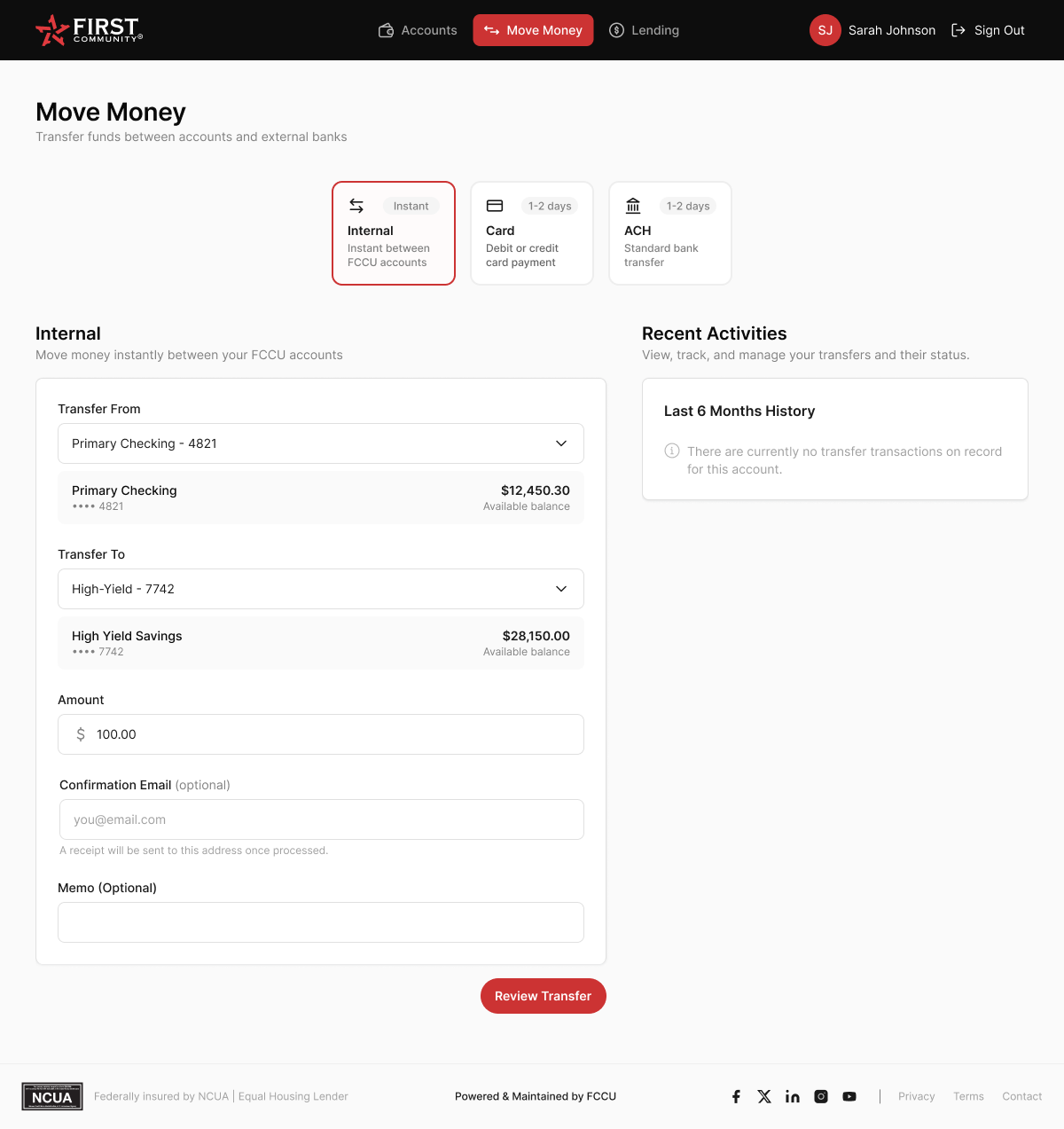
Member task: Move money between your own FCCU accounts. The two screenshots show where the task starts and how the redesign presents the transfer setup.
Before · Payments and Transfers. Account Transfer is one of several cards on a hub for payments, transfers, and related tools. The screenshot shows the entry point, not the form after selecting it.Redesign · Set up an internal transfer. Move Money makes the available routes visible alongside timing labels. The Internal form shows source and destination balances, amount, and optional receipt and memo fields, with Review Transfer as the next step. The screen uses sample data.
The key design change is from choosing an entry on a broad menu to seeing the selected transfer route and its setup in one view. These screens do not establish that the task was completed faster.
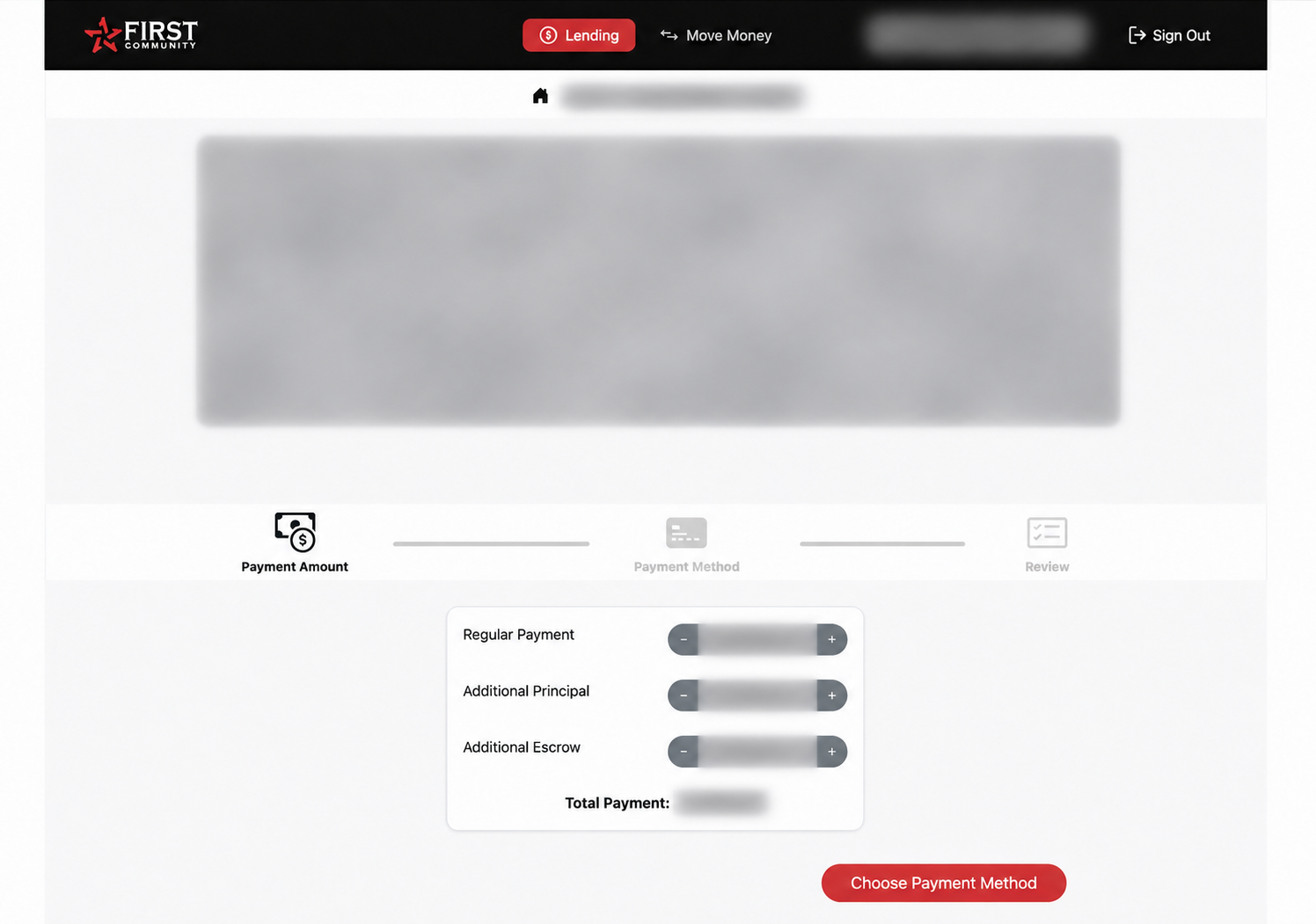
Related flow: mortgage payment
Existing app · Lending. A separate lending workflow uses a step indicator and a Choose Payment Method action. It provides context for how the existing app guides a payment, not a directly comparable internal transfer screen.
Review, confirmation & recovery states
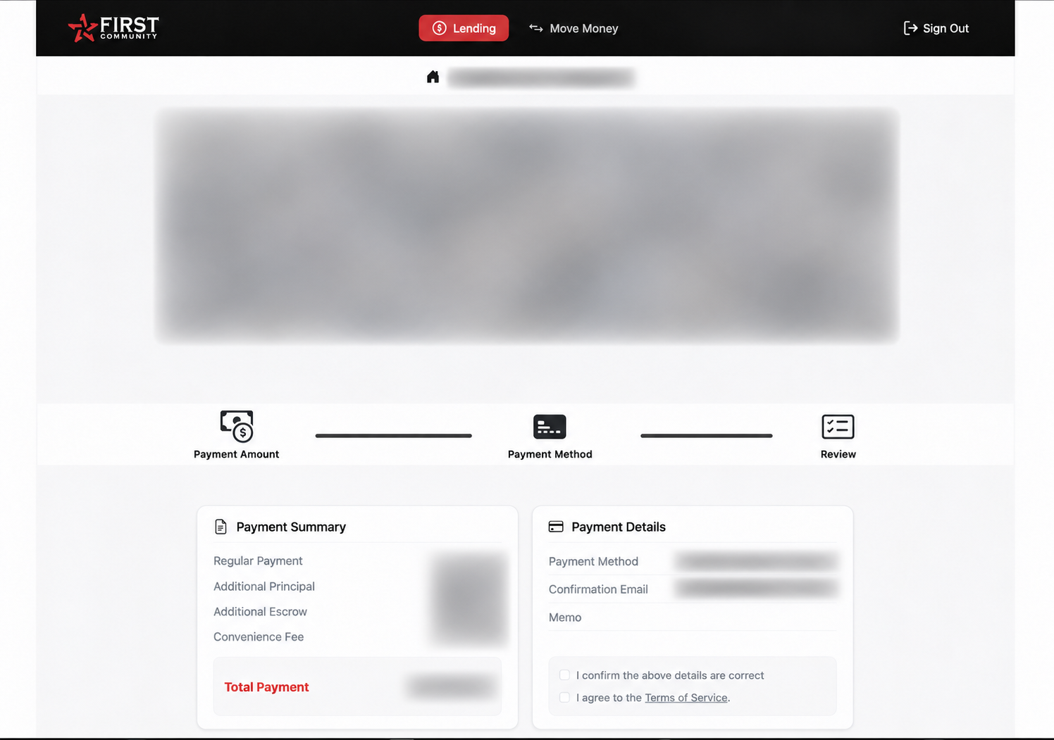
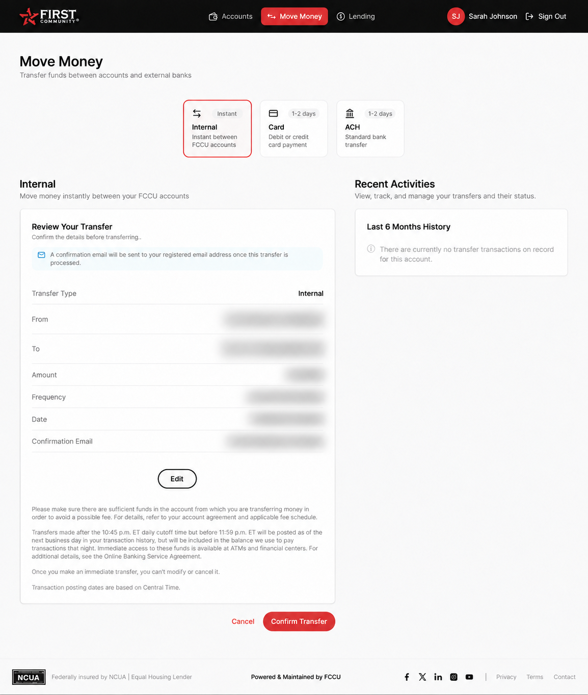
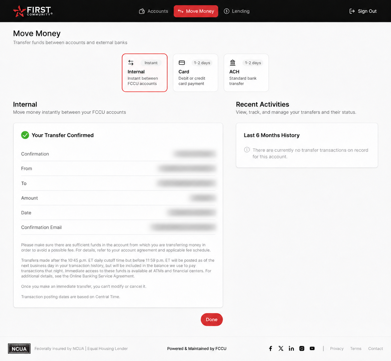
Member task: Review a transfer between your FCCU accounts and correct the amount before sending. The redesign shows two steps: checking the details before submission and finding the confirmation reference afterward. The existing mortgage payment review provides context for the related Lending workflow.
Related workflow · Existing mortgage payment review. The existing Lending screen uses a step indicator and separate Payment Summary and Payment Details panels. Checkboxes ask the member to verify details and acknowledge terms. This is a related payment workflow, not the prior internal transfer review.Redesign · Review your transfer. The redesigned Move Money screen keeps the selected route visible and summarizes the source, destination, amount, and timing before submission. Edit returns members to their details; Cancel gives them an exit before confirming.Redesign · Transfer confirmed. A success heading and confirmation reference distinguish the completed transfer from the review stage. The receipt repeats the key details and offers a Done action.
Recovery: The review screen shows Edit and Cancel before submission. The confirmation screen does not show an undo path. Failed, pending, and unknown-status transfers are separate states and are not shown in this comparison.
Proposed usability task. You meant to send $50, but the review shows $100. Change the amount before sending.
In the redesigned review, members can check From, To, and Amount together, then select Edit to make a correction.
I would test whether members can find Edit and verify the corrected amount without help.
05 / Outcomes
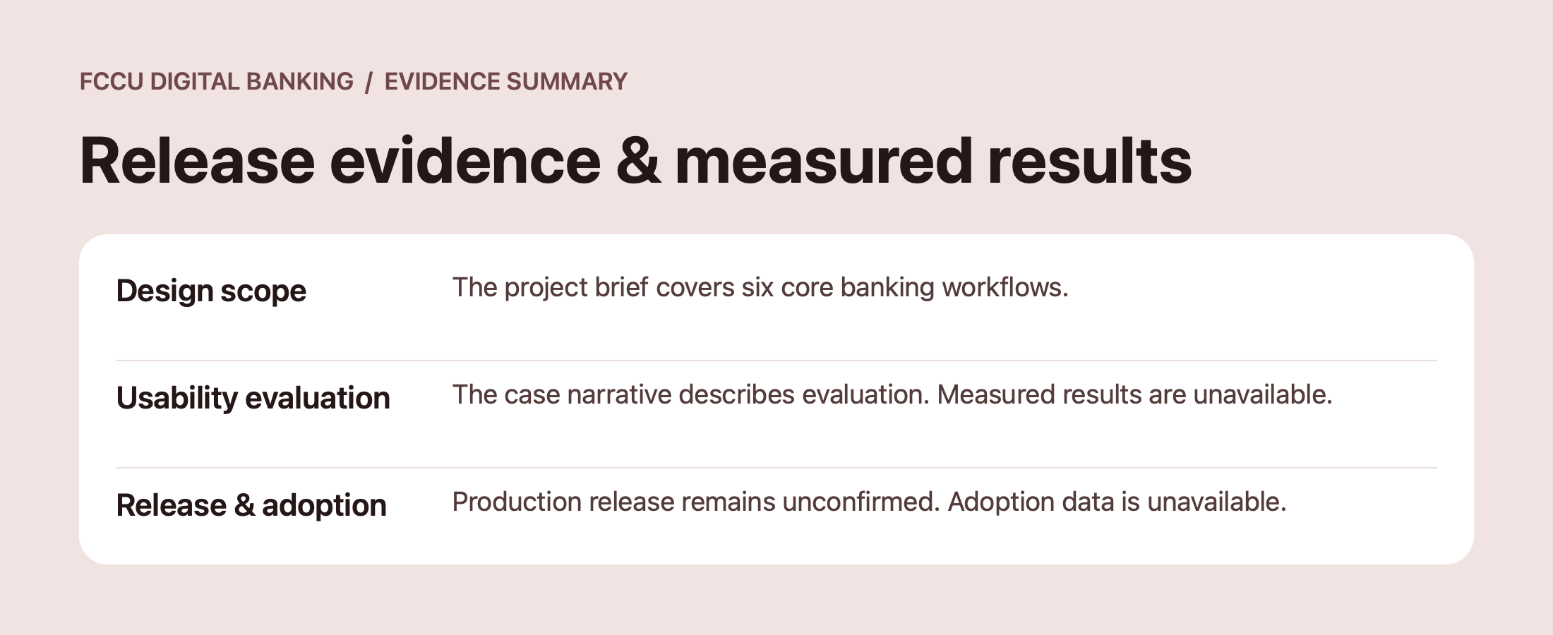
Release evidence & measured results
The project brief covers six core banking workflows, and the case narrative describes usability evaluation. Study results, production release status, and adoption data are pending verification.
Evidence summary based on the project brief and case narrative.
06 / Learning & next steps
Trust comes from understanding what happens next.
High-trust workflows depend on visible consequences, accurate state, and useful recovery. Those same design questions matter when an AI system suggests an action: what will happen, what can the user verify, and where must they stay in control?
Next steps
Confirm the release status, add a representative end-to-end transfer flow, and provide the study method and participant context. Separate prototype task results from production adoption and any projected financial savings.
AI initiative · In progress
Emily — account balances through conversation
We’re developing Emily, an AI assistant for the online banking app, to help members ask for and view balances across their accounts.
The initiative is still in progress. Further capability details, my specific design contribution, and the validation approach are being confirmed. No launch or measured-outcome claims are made at this stage.