Context
The PULSE Mobile App was designed to empower associates and managers at retail Distribution Centers (DCs) with real-time visibility into operations. With a focus on streamlining daily workflows, enhancing communication, and addressing operational inefficiencies, the app aimed to digitize and simplify DC management.
Challenges Identified
- Lack of real-time updates on task priorities and inventory.
- Inefficient navigation between systems to complete daily tasks.
- Strategic oversight, trend analysis.
- Difficulty monitoring KPIs and operational bottlenecks in real-time.
- Limited ability to provide immediate task adjustments or feedback.
Goals
- Enhance operational efficiency by providing accessible, real-time data.
- Create role-specific dashboards to address the unique needs of associates and managers.
- Ensure seamless usability, even in low-connectivity environments.
Key Stages
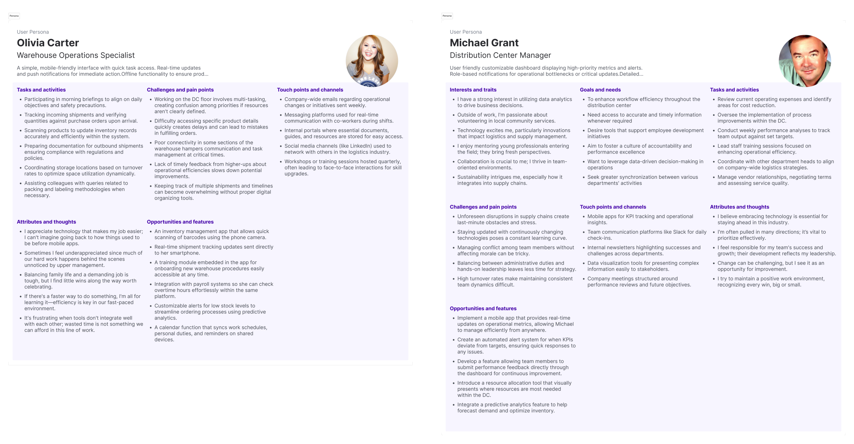
User Research
Interviews and Observations
We conducted one-on-one interviews and shadowed users on-site to understand their workflows, challenges, and expectations. Associates emphasized the need for task prioritization and quick inventory access, while managers highlighted bottlenecks in real-time KPI monitoring and task delegation. Observations revealed inefficiencies caused by constant back-and-forth between workstations and floor tasks.
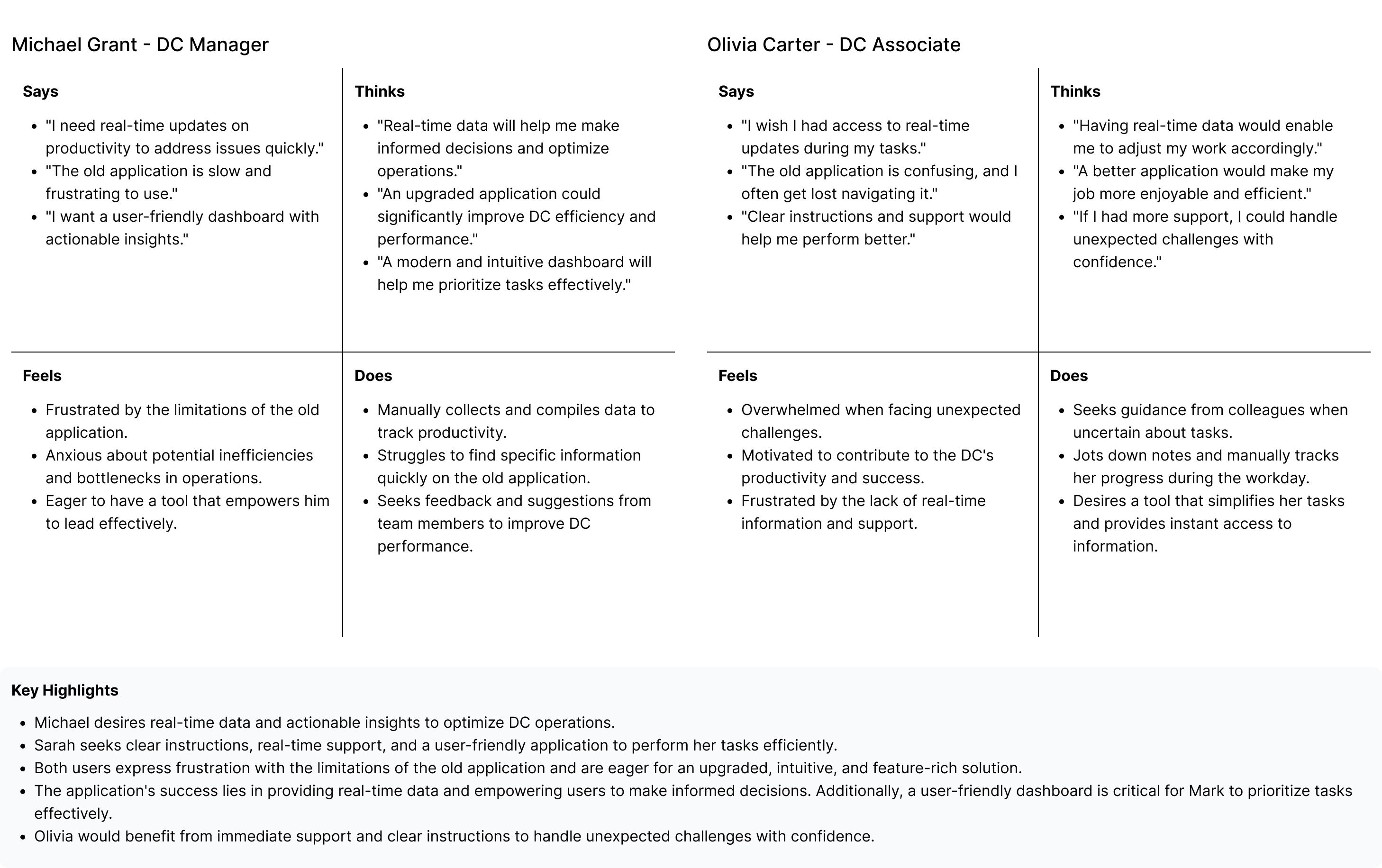
Empathy Mapping
An empathy map helped synthesize insights, showing that users had adapted to unreasonable workloads and fragmented systems over time. While they expected a better system, their mental models were shaped by years of manual “heavy lifting,” making them skeptical but hopeful about new solutions.
Information Architecture & User Flow
Based on insights, we created an information architecture that outlined the app’s structure:
- Associates: Quick access to task lists, inventory search, and task progress.
- Managers: High-level KPI dashboards, bottleneck alerts, and task delegation.
The user flow mapped how users would interact with the app, ensuring seamless navigation for their daily tasks while minimizing unnecessary steps.
Problem Definition
Based on research, the team identified the following pain points:
- Tasks were poorly prioritized, leading to inefficiencies.
- Both roles struggled with cluttered interfaces that buried critical insights.
- Productivity dropped significantly in areas with poor network coverage.
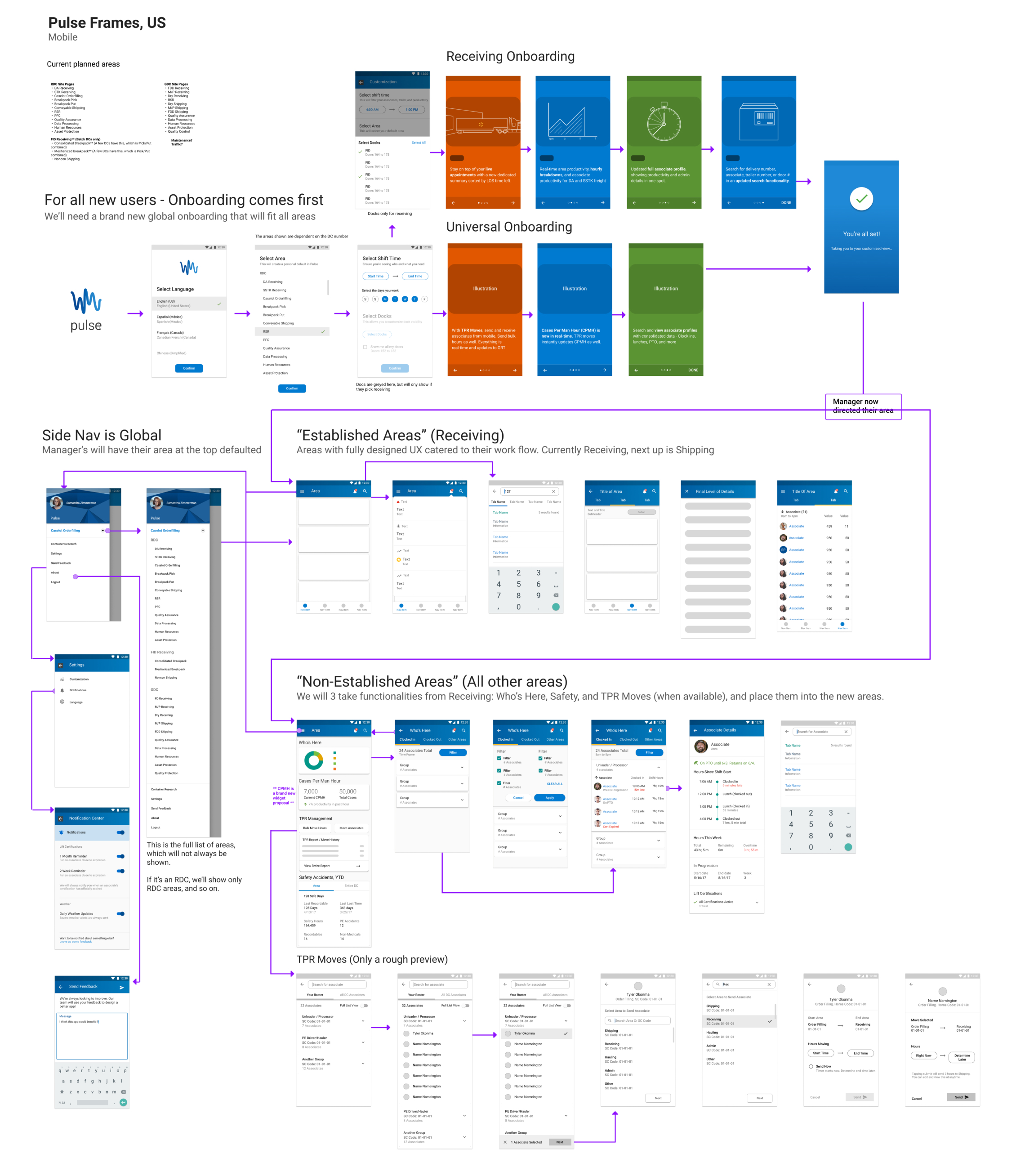
Ideation
Using research findings, we brainstormed and sketched wireframes.
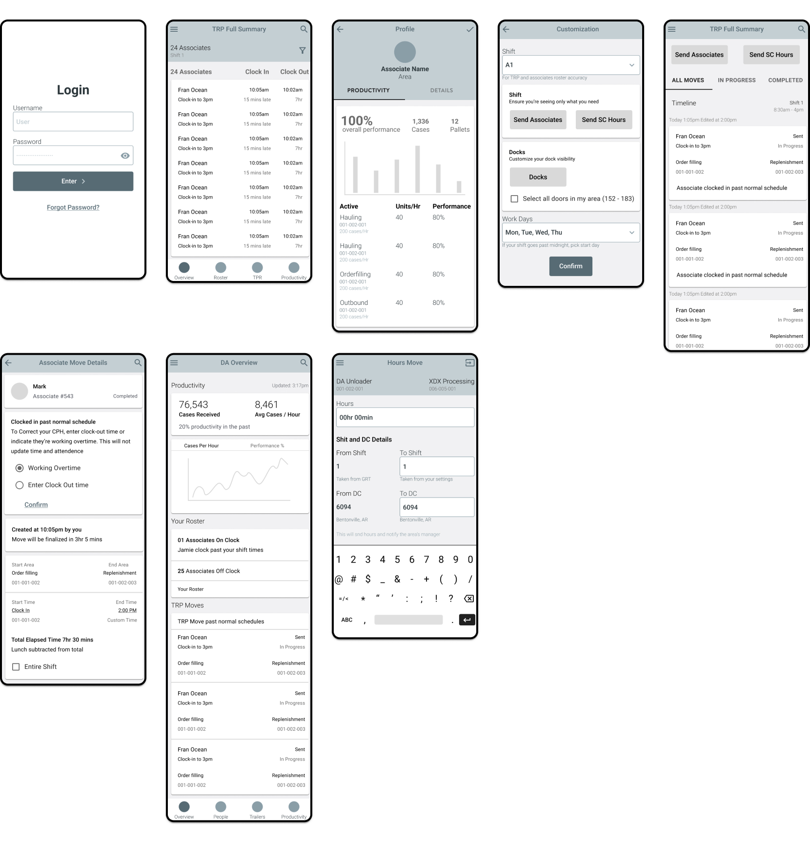
- Low-Fidelity Wireframes: Focused on layout, navigation, and role-specific features.
Usability Testing
A user-centered design process, focusing on simplicity and clarity.
Participants
- 15 associates and 10 managers across different DCs.
Key Insights
- Associates valued task prioritization and quick navigation.
- Managers appreciated the ability to filter and customize KPI views.
Iterations
- Introduced visual priority tags for tasks.
- Simplified navigation with a focus on role-based content.
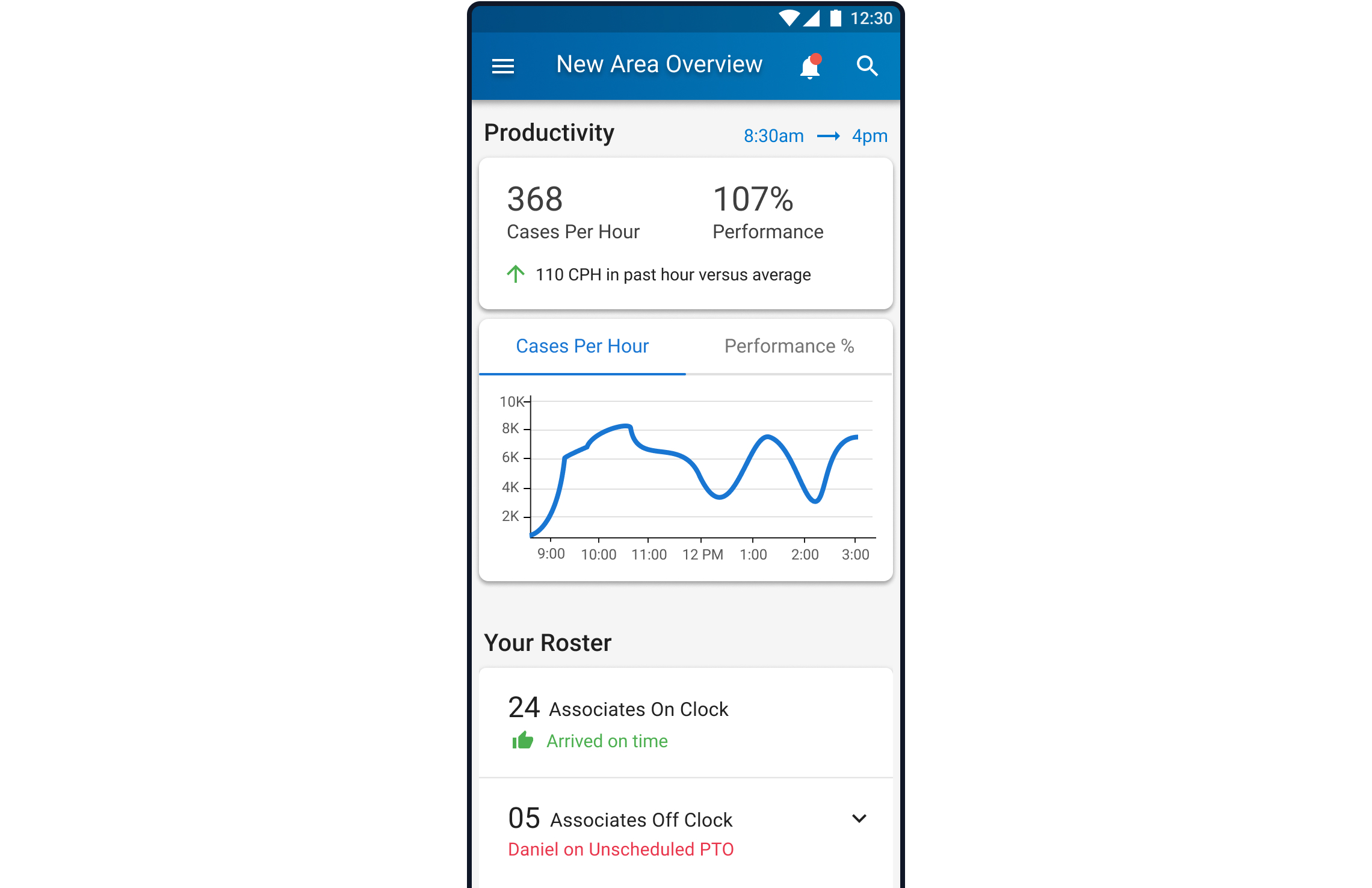
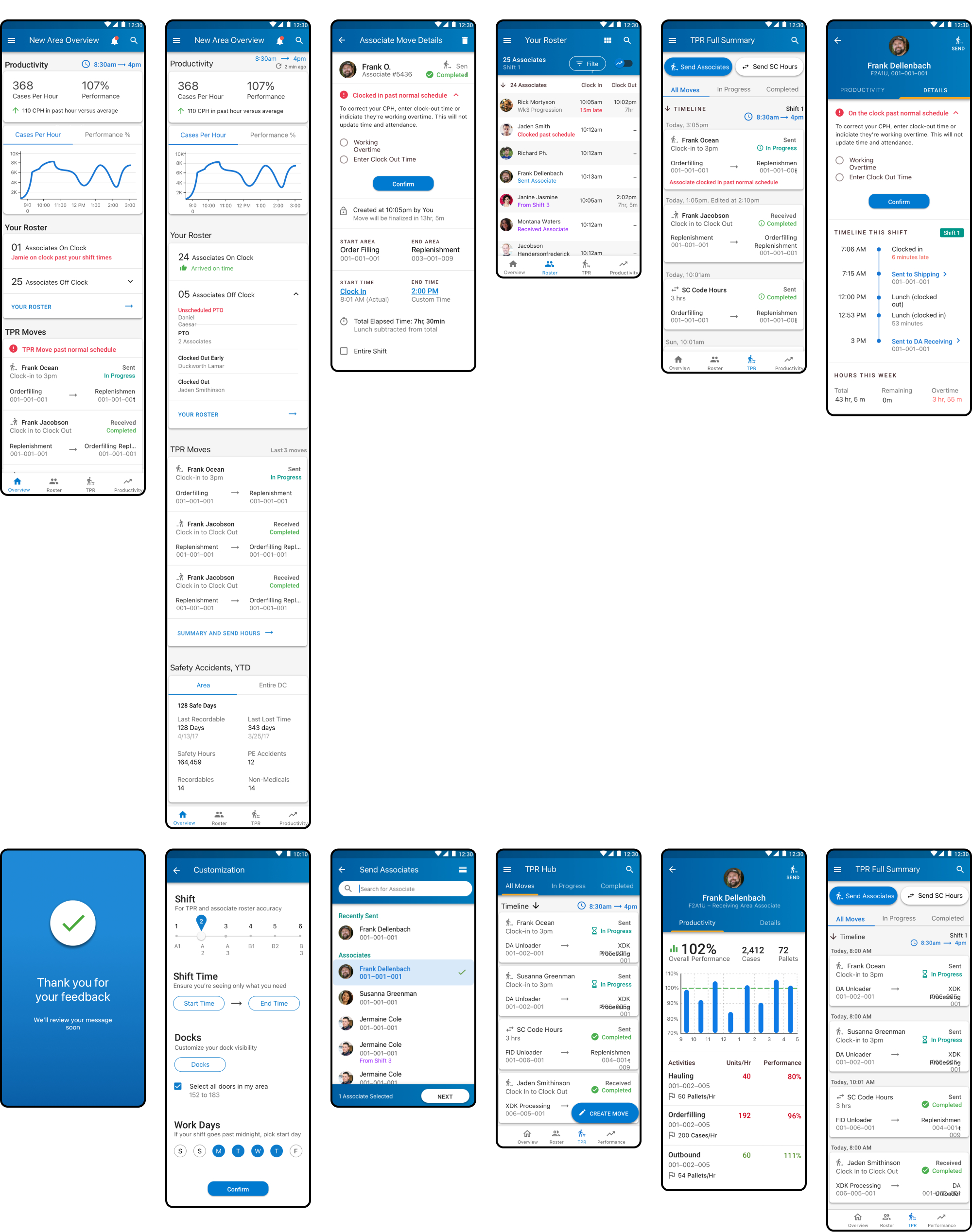
Final Design
Once I tested out all usability mistakes, I started designing the final screens in Figma.
We adopted a fresh and clean, light visual style (LD3 Design System) to enhance clarity and usability, ensuring an approachable and efficient interface for users in fast-paced environments.
The need for simplicity and focus in Distribution Centers inspired the style. A light, clean design reduces cognitive load and allows quick access to critical information.
Impact
Operational Efficiency
- 15% reduction in handling times.
- Fewer errors with real-time updates.
Agent Experience
- 25% satisfaction increase.
- Faster onboarding with guided navigation.
Customer Satisfaction
- Better feedback scores from faster resolutions.
Learning and Next Steps
Key Learnings
- User involvement ensured relevance and adoption.
- Iterative testing aligned design with needs.
- Collaboration with developers eased implementation.
Next Steps
- Monitor performance and optimize further.
- Ensure scalability for evolving needs.
- Establish feedback loops for improvement.